At Camfirst Solutions, we help businesses build cohesive brand identities that stand out across every channel. A brand style guide is the single most important document your business can create to protect and strengthen its identity. Without one, your marketing materials, website, social media posts, and print collateral will inevitably drift apart in look and feel. That inconsistency erodes trust. A well-crafted brand style guide ensures that every person who touches your brand — whether an in-house designer, a freelance copywriter, or an agency partner — produces work that feels unmistakably yours.
This tutorial walks you through every section a professional brand style guide should contain, from foundational elements like mission and values all the way to practical templates and asset libraries.
Why a Brand Style Guide Matters
Consistency is not a luxury. Research consistently shows that brands presenting a unified identity across all platforms see significantly higher revenue growth than those that do not. A brand style guide serves as the authoritative reference for how your company looks, sounds, and communicates. It eliminates guesswork, reduces revision cycles, and empowers teams to produce on-brand work independently.
Whether you are a startup defining your identity for the first time or an established company tightening up a brand that has drifted, a style guide is the foundation. If you need professional help establishing your visual identity, our graphic design services can build every element covered below.
Section 1: Brand Mission, Vision, and Values
Start with Your Purpose
The opening section of your brand style guide should articulate why your company exists. This is not marketing copy — it is the internal compass that informs every design and messaging decision that follows.
- Mission statement — A concise declaration of what your company does, who it serves, and the value it delivers. Keep it to one or two sentences.
- Vision statement — Where the company is headed. This is aspirational and forward-looking.
- Core values — Three to five principles that define how your company operates. Values like “transparency,” “innovation,” or “customer-first” should be specific enough to guide real decisions, not so generic that they could apply to any business.
Including these elements at the front of your guide ensures that everyone creating brand assets understands the deeper purpose behind the visuals and language.
Section 2: Logo Usage Rules
Define Every Acceptable Use
Your logo is the most recognizable element of your brand. The style guide must leave no ambiguity about how it can and cannot be used.
- Primary logo — The default version used in most contexts.
- Secondary logo — An alternative layout, such as a stacked version or icon-only mark, used when the primary logo does not fit.
- Minimum size — The smallest dimensions at which the logo may be reproduced while remaining legible.
- Clear space — The minimum amount of empty space that must surround the logo on all sides, typically defined as a proportion of the logo itself.
- Approved color variations — Full color, single color, reversed (white on dark background), and grayscale versions.
- Incorrect usage examples — Show explicit examples of what not to do: stretching, rotating, changing colors, adding drop shadows, placing the logo on busy backgrounds, or altering the proportions.
Providing downloadable logo files in multiple formats (SVG, PNG, EPS) alongside these rules makes compliance effortless for anyone working with your brand.
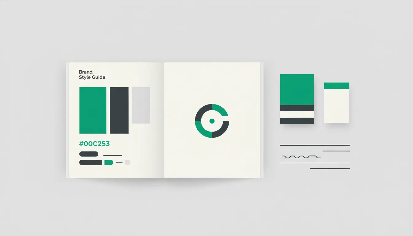
Section 3: Color Palette Selection
Build a Palette with Purpose
Color is one of the fastest ways an audience recognizes your brand. Your style guide should define a complete color system with exact values.
- Primary colors — The one or two colors most closely associated with your brand. These dominate your website, logo, and key marketing materials.
- Secondary colors — Supporting colors that complement the primary palette and provide variety without diluting recognition.
- Accent colors — Used sparingly for calls to action, highlights, or interactive elements.
- Neutral colors — Background tones, text colors, and border shades that round out the system.
For each color, provide the following values: HEX code, RGB values, CMYK values (for print), and Pantone reference if applicable. Include usage ratios — for example, 60 percent primary, 30 percent secondary, 10 percent accent — to prevent overuse of any single color.
A thoughtful color palette is critical for both graphic design and UI/UX design, as it directly affects usability, accessibility, and emotional response.
Section 4: Typography Hierarchy
Choose Fonts That Reflect Your Brand Personality
Typography carries tone just as much as the words themselves. Your guide should specify every typeface your brand uses and exactly where each one applies.
- Primary typeface — The font used for headlines, hero sections, and major display text. This is typically a bold or distinctive typeface that captures your brand personality.
- Secondary typeface — Used for body copy, paragraphs, and longer reading contexts. Readability is the priority here.
- Tertiary or monospace typeface — Optional. Used for captions, code snippets, technical documentation, or supporting text.
For each typeface, define:
- Weights — Which weights are approved (Light, Regular, Medium, Bold, etc.).
- Sizes — Minimum and maximum sizes for headings (H1 through H6), body text, captions, and buttons.
- Line height and letter spacing — Precise values that ensure comfortable reading across devices.
- Web fonts vs. print fonts — If different typefaces are used for digital and print, document both with clear context.
Consistent typography across your website and marketing materials reinforces professionalism and readability.
Section 5: Imagery Style
Set Standards for Photography, Illustration, and Icons
Visual content must feel cohesive. Without guidelines, you end up with a mix of stock photography styles, inconsistent illustration approaches, and mismatched icon sets.
- Photography direction — Define the mood (bright and airy, dark and moody, candid, staged), color grading preferences, subject matter, and composition rules. If you use models, specify diversity and representation standards.
- Illustration style — Flat, isometric, hand-drawn, or 3D. Define line weights, color usage, and the level of detail.
- Iconography — Outline or filled, rounded or sharp corners, consistent stroke width, and a defined icon grid size.
- Image filters and overlays — If you apply color overlays, gradients, or specific filters to images, document the exact settings.
Include example images that represent the approved style alongside examples of imagery that falls outside your brand standards.
Section 6: Tone of Voice and Messaging
Define How Your Brand Speaks
Your brand voice should be as distinctive and consistent as your visual identity. This section bridges the gap between design and copywriting.
- Brand personality traits — Describe your voice using three to five adjectives. For example: “confident, approachable, and knowledgeable” or “bold, straightforward, and witty.” For a detailed look at how design and voice work together, see our UI/UX design process guide.
- Tone spectrum — Tone shifts depending on context. Map out how your voice adjusts across situations: a customer complaint response sounds different from a product launch announcement, but both should feel like the same brand.
- Vocabulary preferences — Words and phrases your brand favors, and those it avoids. For example, a tech company might prefer “build” over “create” and avoid jargon like “synergy.”
- Grammar and punctuation conventions — Oxford comma or not, use of contractions, sentence length preferences, and capitalization rules for headlines.
A well-defined tone of voice is essential for digital marketing efforts, where your brand communicates across dozens of channels simultaneously.
Section 7: Social Media Guidelines
Maintain Brand Integrity Across Platforms
Social media is where brand inconsistency most frequently appears. Each platform has different formats, audiences, and conventions, so your guide must account for all of them.
- Profile and cover images — Dimensions, layout, and approved variations for each platform (Instagram, LinkedIn, Facebook, X, YouTube, TikTok).
- Post templates — Pre-designed templates for recurring content types: quotes, announcements, product features, testimonials, and promotions.
- Hashtag strategy — Branded hashtags, industry hashtags, and rules for hashtag usage per platform.
- Engagement tone — How your brand responds to comments, direct messages, and mentions. Define the voice for positive interactions, neutral inquiries, and complaints.
- Content mix — Recommended ratios for educational, promotional, entertaining, and community-building content.
Documenting these standards prevents the fragmented look that occurs when multiple team members post without a unified framework. For a broader view of how to plan and schedule brand-consistent content, read our guide on how to create a content calendar.
Section 8: Templates and Asset Libraries
Give Your Team Ready-to-Use Resources
A style guide is only effective if people actually use it. Providing templates and organized asset libraries dramatically increases adoption.
- Presentation templates — Branded slide decks for sales, internal meetings, and conferences.
- Document templates — Letterheads, proposals, invoices, and reports that carry your brand identity.
- Email templates — Newsletter layouts, transactional emails, and outreach templates.
- Social media templates — Editable files in Canva, Figma, or Adobe Creative Suite for common post formats.
- Asset library — A centralized, organized repository of logos, icons, photography, illustrations, fonts, and color swatches. Cloud-based tools like Google Drive, Dropbox, or Brandfolder keep everything accessible.
Every template should be editable but locked in terms of brand elements — fonts, colors, logo placement, and spacing should be preset so users can modify content without breaking the design.
Section 9: Brand Do’s and Don’ts
Make the Rules Unmistakably Clear
Sometimes the most effective section of a style guide is the simplest. A visual side-by-side comparison of correct and incorrect brand usage eliminates ambiguity faster than paragraphs of instructions.
Do:
- Use approved logo files downloaded from the official asset library.
- Maintain minimum clear space around the logo at all times.
- Use brand colors in the documented ratios.
- Follow the typography hierarchy for all headings and body text.
- Apply the approved image style to all photography and illustrations.
Do not:
- Recreate the logo from memory or alter its proportions.
- Introduce new colors outside the approved palette without brand team approval.
- Use unapproved fonts, even if they look similar to the brand typeface.
- Place the logo on cluttered or low-contrast backgrounds.
- Mix illustration styles or icon sets within the same project.
These do’s and don’ts should appear throughout the guide alongside each relevant section, and a consolidated summary at the end reinforces the key rules.
Section 10: Maintaining Consistency Across Channels
Build Processes That Scale
Creating a brand style guide is only the first step. Maintaining consistency as your team grows and your marketing channels multiply requires deliberate processes.
- Brand guardian role — Assign a person or small team responsible for reviewing materials before publication and updating the guide as the brand evolves.
- Regular audits — Schedule quarterly reviews of your website, social media profiles, print materials, and third-party listings to catch drift before it becomes entrenched.
- Onboarding integration — Make the brand style guide part of every new hire’s onboarding, whether they work in marketing, sales, customer support, or product development.
- Version control — Date each version of the guide and maintain a changelog. Brands evolve, and your guide should evolve with them — but in a documented, intentional way.
- Feedback loop — Encourage team members and partners to flag situations where the guide does not provide clear direction. These gaps are opportunities to strengthen the document.
A living brand style guide, supported by clear processes, ensures that your brand identity remains strong and recognizable no matter how many people contribute to it. Pairing your brand guide with a comprehensive social media marketing strategy ensures that every post reinforces the identity you have built.
Get Professional Help Building Your Brand Identity
A comprehensive brand style guide transforms your brand from a collection of loosely related assets into a unified, recognizable identity. Every section — from mission and values through templates and audits — plays a role in protecting the consistency that builds trust with your audience.
At Camfirst Solutions, our graphic design and UI/UX design teams specialize in building brand systems that scale. Combined with our web development and digital marketing expertise, we ensure your brand looks and performs its best across every channel. Contact us today to start building a brand identity that stands out and stays consistent.