At Camfirst Solutions, we have helped SaaS companies build websites that convert visitors into paying customers. Your SaaS website is not a brochure. It is your most productive salesperson, working around the clock to qualify leads, communicate value, and convert visitors into paying customers. Yet most SaaS companies treat their website as an afterthought — a place to park a feature list and a signup button, then wonder why conversion rates remain stubbornly low.
The difference between a SaaS website that converts at one percent and one that converts at five percent is not luck. It is design strategy. Every element on every page must earn its place by moving visitors closer to a decision. In this guide, we break down the design principles, page structures, and technical best practices that the highest-converting SaaS websites share.
Value Proposition Clarity
You have roughly five seconds to convince a first-time visitor that your product is worth their attention. If your hero section does not immediately communicate what your software does, who it is for, and why it matters, visitors will leave before scrolling.
A strong SaaS value proposition follows a simple formula: state the outcome your customer wants, not the features your product has. “Manage your entire project pipeline in one place” is more compelling than “Project management software with Gantt charts, Kanban boards, and time tracking.” The first speaks to a pain point; the second reads like a spec sheet.
Your headline should be concise — ideally under twelve words. A supporting subheadline of one to two sentences can add context, but it should reinforce the headline rather than introduce new concepts. Below the subheadline, place a single, prominent call-to-action button. Do not split attention between multiple CTAs in the hero section; decide whether “Start Free Trial” or “Book a Demo” is your primary conversion path and commit to it.
Visual reinforcement matters. A product screenshot, short demo video, or animated illustration in the hero section shows visitors what your software actually looks like, building credibility and setting expectations. Abstract stock imagery does neither. For a detailed walkthrough of this process, see our UI/UX design process guide.
Professional UI/UX design ensures that your value proposition is not just well-written but visually structured to guide the eye from headline to CTA in a natural, friction-free flow.
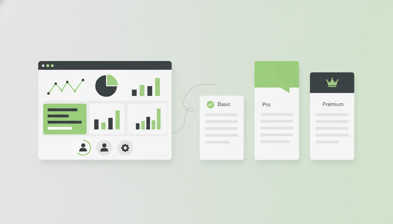
Pricing Page Design
The pricing page is the most visited page on most SaaS websites after the homepage. It is also where the majority of potential customers either commit or abandon the funnel. Getting pricing page design right is not optional.
Present three to four tiers at most. More options create decision paralysis. Each tier should have a clear name that communicates its intended audience: “Starter,” “Professional,” and “Enterprise” are effective because they help visitors self-select. Highlight the most popular or recommended plan with a visual indicator such as a colored border, badge, or slightly larger card.
Feature lists within each tier should be scannable. Use checkmarks and clear labels rather than lengthy descriptions. Place the most important differentiating features at the top of the list, and display unavailable features with a muted style rather than omitting them — this shows visitors what they gain by upgrading.
Default to annual billing and clearly display the savings percentage. Avoid making visitors do math; show the annual price as a monthly equivalent alongside the actual annual cost. For enterprise tiers where pricing is custom, replace the price with “Contact Sales” and include a brief form directly on the pricing page.
Free Trial and Call-to-Action Strategy
The call-to-action is the most important element on your SaaS website, and its effectiveness depends on far more than button color. CTA strategy involves placement, language, context, and the reduction of perceived risk.
“Start Free Trial” outperforms “Sign Up” because it emphasizes what the visitor gets (free access to the product) rather than what they have to do (create an account). “No credit card required” is one of the most effective trust signals in SaaS — if your trial does not require payment information, say so directly beneath the CTA button.
Place CTAs at natural decision points throughout the page: after the hero section, after key feature explanations, after social proof, and at the page footer. Avoid aggressive pop-ups or exit-intent modals that erode trust. For products with longer sales cycles, offer a secondary CTA such as “Watch Demo” or “Schedule a Walkthrough” to capture leads that are not yet ready for a trial. Our guide on how to create landing pages that convert covers CTA optimization in greater detail.
Feature Comparison Tables
SaaS buyers are methodical. They research multiple solutions before committing, and they want to compare capabilities side by side. A well-designed feature comparison table on your website can control that narrative and position your product favorably.
Structure your comparison table with your product and two to three competitors as column headers. Be honest — listing features your product lacks builds credibility far more effectively than omitting them. Where your product falls short, emphasize adjacent strengths or note that the feature is on your roadmap.
Use comparison tables on the pricing page to differentiate between tiers and on dedicated landing pages targeting competitors’ customers. Keep tables responsive — on mobile devices, use a tabbed or accordion layout that lets users compare one competitor at a time rather than forcing horizontal scrolling.
Effective comparison pages require both strong web development for responsive table components and thoughtful content strategy to frame comparisons persuasively.
Social Proof That Converts
Social proof is the most powerful persuasion tool on a SaaS website, but only when it is specific, relevant, and credible. Generic testimonials like “Great product, highly recommend!” add almost no value.
Effective social proof takes several forms, and the best SaaS websites use all of them:
- Customer logos displayed in a horizontal row on the homepage. Even three or four recognizable brands create an immediate credibility boost.
- Quantified testimonials that reference specific outcomes: “We reduced our onboarding time by 40% within the first month” is far more compelling than “This software is easy to use.”
- Case studies following a problem-solution-result structure, each focused on a specific customer segment.
- Usage statistics such as “Trusted by 10,000+ teams” provide scale-based credibility.
- Third-party review badges from G2, Capterra, and Trustpilot add independent validation.
Place social proof strategically: customer logos below the hero section, testimonials adjacent to feature descriptions and pricing, and case studies in their own dedicated section.
Onboarding Flows and Product Tours
Your website’s job does not end at signup. The experience between account creation and the user’s first moment of value — the “aha moment” — determines whether a trial user becomes a paying customer or a churn statistic.
Design your onboarding flow to get users to value as quickly as possible. This starts with a streamlined signup form. Ask for the minimum information needed to create an account: name, email, and password. Every additional field reduces completion rates. Company name, role, and team size can be collected after signup through a brief onboarding questionnaire that personalizes the product experience.
Welcome screens should present two to three clear next steps rather than dumping users into an empty dashboard. Progress indicators showing completion percentage create momentum and encourage users to finish setup. Interactive product tours that highlight key features in context are more effective than video tutorials — use tooltip-based walkthroughs that activate contextually and dismiss once completed, letting users explore freely while providing guidance.
Building these onboarding experiences requires web application development expertise that goes beyond standard website design, combining frontend interactivity with backend user state management.
Integration Pages
SaaS products do not exist in isolation. Your customers use dozens of tools, and your product’s ability to connect with their existing stack is often a deciding factor in the purchase decision. Integration pages are among the highest-traffic, highest-intent pages on most SaaS websites.
Create a dedicated integrations directory page that displays all available integrations as a searchable, filterable grid. Organize integrations by category — CRM, communication, project management, accounting, marketing — so visitors can quickly find what is relevant. Each integration should have its own detail page covering what it does, how to set it up, and any limitations.
If your product integrates with industry leaders like Salesforce, Slack, HubSpot, or QuickBooks, feature those prominently on your homepage and product pages. For products with an API, dedicate a section to developer documentation with clear endpoints, code examples, and authentication guides — this signals technical maturity and opens your product to custom integrations.
Performance and Page Speed
Page speed is a conversion factor, not just a technical metric. Research consistently shows that each additional second of load time reduces conversions by approximately seven percent. For a SaaS website where the goal is trial signups, slow pages directly translate to lost revenue.
Optimize images aggressively. Use modern formats like WebP or AVIF with fallbacks for older browsers. Implement lazy loading for images below the fold. Serve appropriately sized images based on the visitor’s viewport rather than loading full-resolution assets on every device.
Minimize JavaScript bundle sizes. SaaS websites frequently accumulate third-party scripts — analytics, chat widgets, A/B testing tools, heatmaps — that collectively add hundreds of kilobytes and dozens of network requests. Audit your scripts regularly, remove anything that is not actively providing value, and load non-critical scripts asynchronously.
Core Web Vitals — Largest Contentful Paint, Cumulative Layout Shift, and Interaction to Next Paint — are the metrics that matter most. Google uses these signals for search ranking, which connects performance directly to your organic acquisition channel. Monitor them continuously and address regressions immediately. Beyond performance, ensure your SaaS website follows cybersecurity best practices to protect user data and build trust.
SEO Strategy for SaaS Websites
Organic search is one of the most scalable and cost-effective acquisition channels for SaaS companies, but it requires a deliberate strategy that extends well beyond keyword stuffing and meta tags.
Start with bottom-of-funnel content that targets buyers who are actively searching for a solution. Pages targeting keywords like “best [category] software,” “[competitor] alternative,” and “[your product] vs [competitor]” capture high-intent traffic closest to a purchase decision. Middle-of-funnel content addresses problems your product solves without directly pitching your software, attracting prospects who are experiencing the pain your product alleviates. Top-of-funnel content builds brand awareness and domain authority through educational resources and thought leadership.
Technical SEO fundamentals must be solid: clean URL structures, proper heading hierarchy, schema markup for software applications and FAQ content, fast page speeds, mobile responsiveness, and a logical internal linking structure that distributes authority across your most important pages. A dedicated SEO services partner ensures these fundamentals are implemented correctly from launch.
A comprehensive custom software development partner can help you build the technical foundation — from server-side rendering to dynamic sitemap generation — that makes your SEO strategy executable at scale.
Analytics and A/B Testing
Data-driven design decisions consistently outperform gut instinct. The highest-converting SaaS websites treat their design as a living system that evolves based on user behavior data and controlled experiments.
Implement comprehensive analytics tracking from day one. Beyond basic pageviews and session duration, track micro-conversions such as pricing page visits, feature page engagement, demo video plays, and CTA clicks. These intermediate metrics reveal where visitors engage and where they disengage, highlighting opportunities for optimization.
Set up conversion funnels to visualize the path from landing page to signup. Identify the steps with the highest drop-off rates and prioritize those for improvement.
A/B testing allows you to validate design changes with statistical rigor rather than opinion. Test one variable at a time: headline copy, CTA button text, pricing page layout, or form field count. Run tests until they reach statistical significance, and resist the temptation to call results early based on initial trends. Complement quantitative data with heatmaps and session recordings that reveal confusion and hesitation analytics dashboards cannot surface.
The combination of analytics, testing, and iterative design is what separates SaaS websites that plateau from those that continuously improve their conversion rates.
Turning Your Website Into a Growth Engine
A SaaS website that converts is not built in a single sprint. It is the product of clear value communication, strategic page design, relentless performance optimization, and a commitment to data-driven iteration. The best practices outlined in this guide are not theoretical; they are the patterns that consistently produce results across SaaS companies of every size and category.
The common thread is intentionality. Every headline, every image, every button, and every page load time should be a deliberate choice informed by your understanding of your customer and validated by their behavior on your website.
Partner with SaaS Website Design Experts
At Camfirst Solutions, we build SaaS websites that are engineered for growth. Our team combines web application development, UI/UX design, and digital marketing to create websites that convert trial users into paying customers. Whether you are preparing for your first product launch or redesigning an existing site to improve conversion rates, we deliver measurable results. Contact us to start building a SaaS website that turns visitors into customers.